Minecraft Booklet - Spread 2
Minecraft Booklet - Spread 3

Minecraft Booklet - Spreads gif
Minecraft Booklet - Cover
Minecraft Booklet - Die Cut Detail 2
Minecraft Booklet
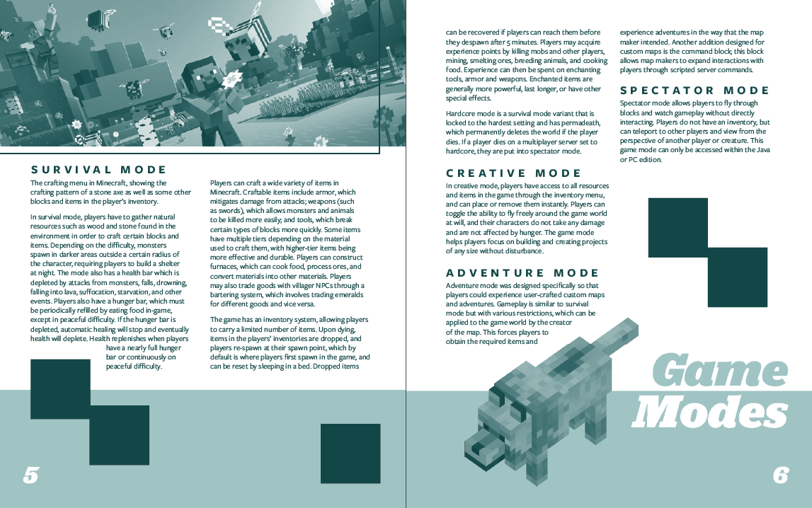
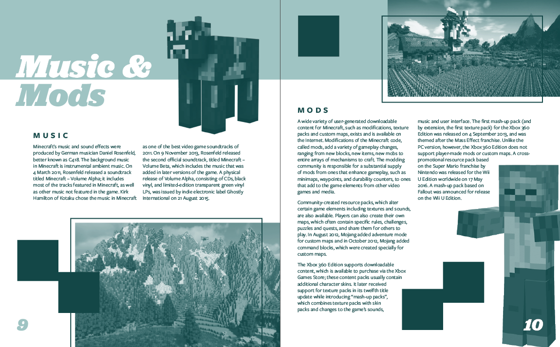
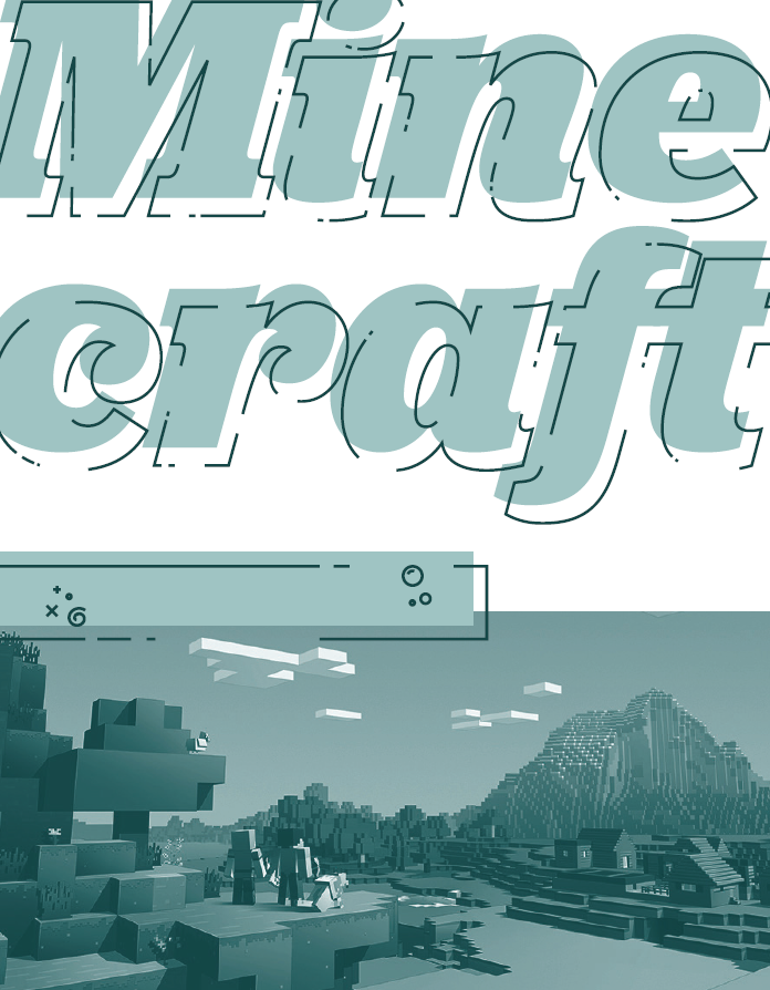
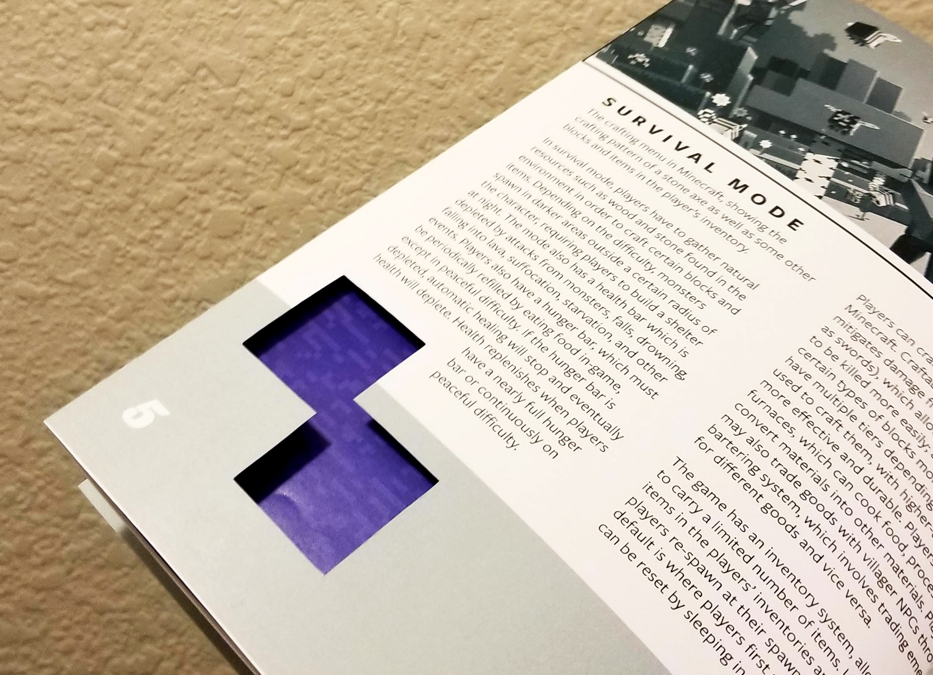
For this case study, I explored spread layout with monochromatic constraints, using text from the "Minecraft" video game Wikipedia page. The book was hand assembled using a french fold for each page, including full color versions of recognizable textures from the video game on the inside of the folds. To show the images inside the pages, square die cuts were hand cut into each page, planned in the design phase to fit accordingly into each design. The game is known for being blocky and pixelated, using fonts which fit within the theme. For this booklet, I used hints of these visual components.
VR Sound Fest - Music Festival Poster
The "VR Sound Fest" poster is a case study in typographical music festival posters. Inspired by the look of Windows 98 and the vaporwave aesthetic, this poster was created using a glitchy pixel art style that helps sell the idea of a music festival inside a virtual setting. I pushed the typography beyond the limits of conventional typeface, creating my own scratchy hand lettered title. This poster combines my love for pixel art, design and typography.
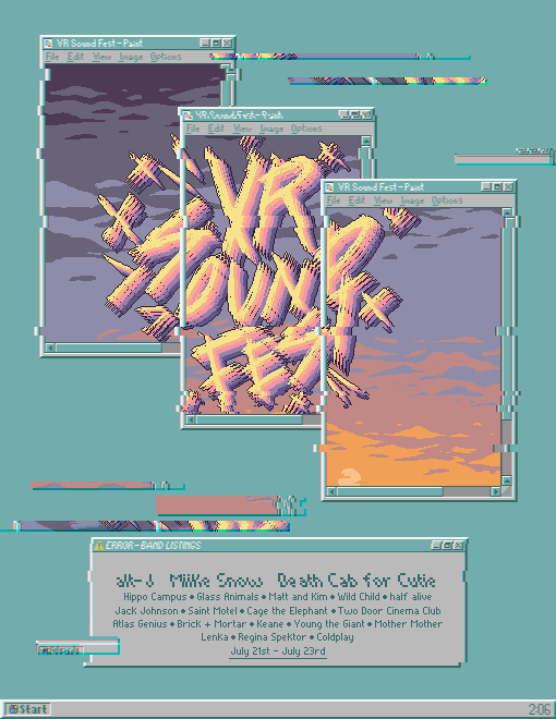
VR Sound Fest - Fictional Music Festival Poster
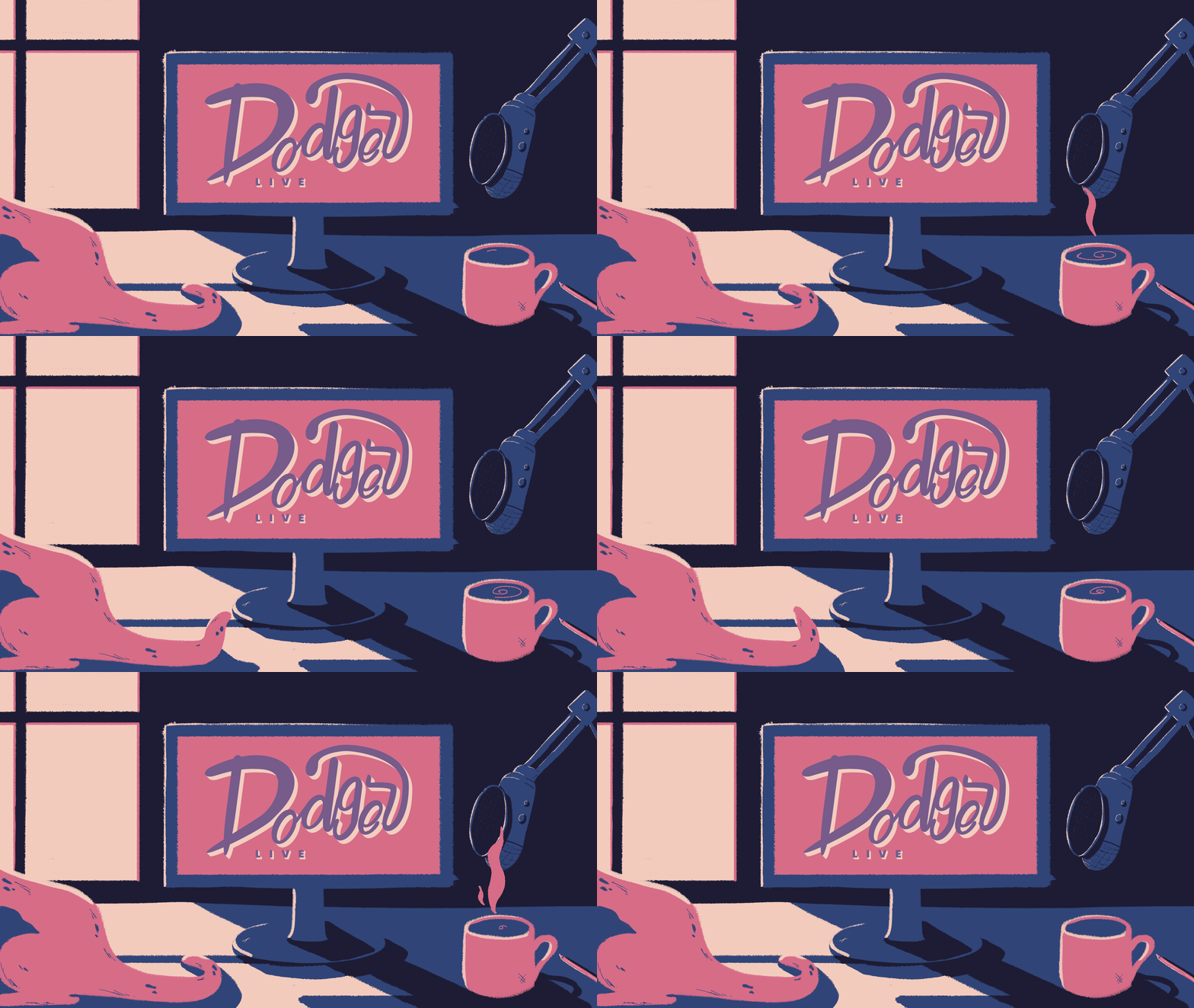
Dodger Redesign - Stream Starting Soon Animation
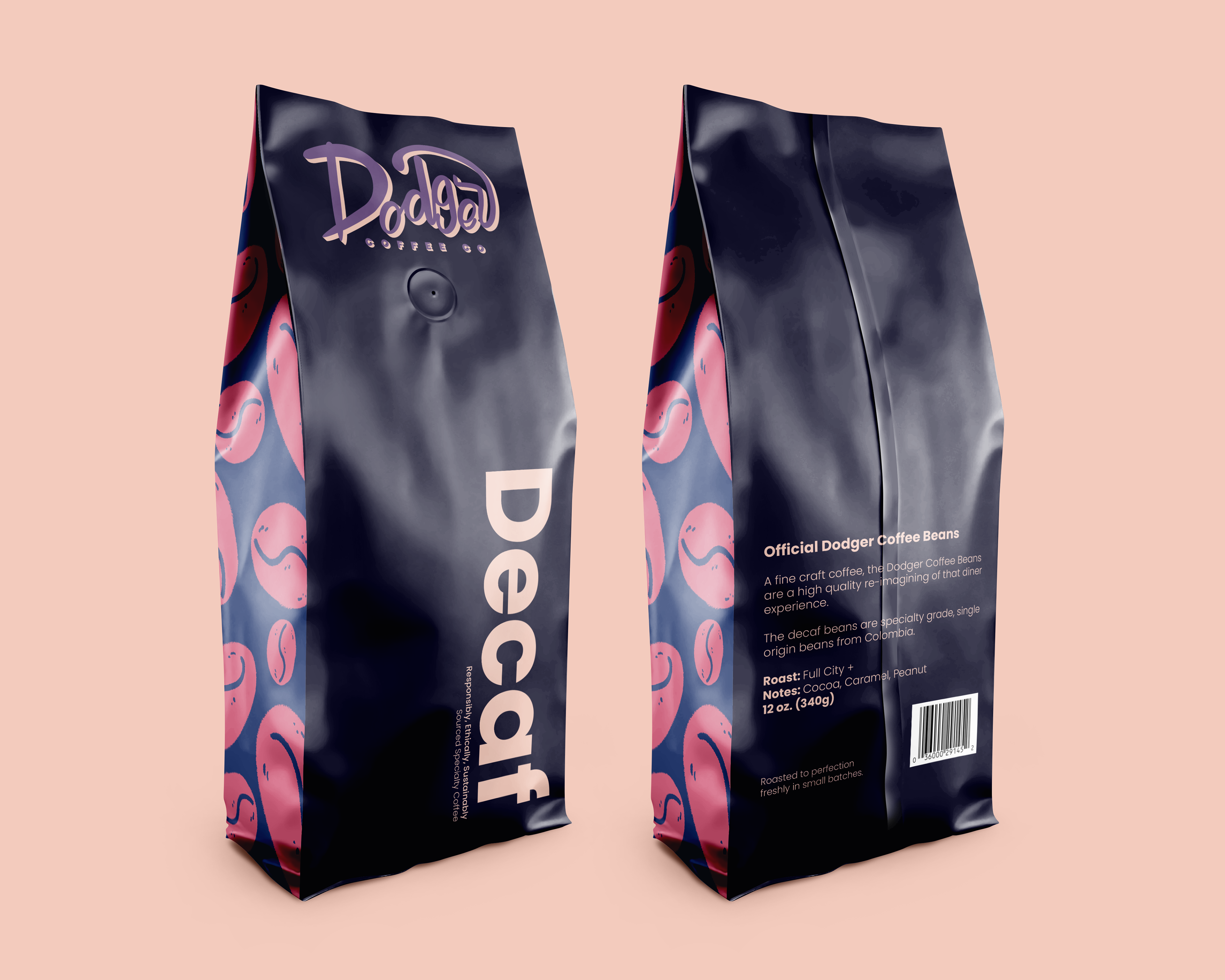
Dodger Redesign - Decaf Packaging
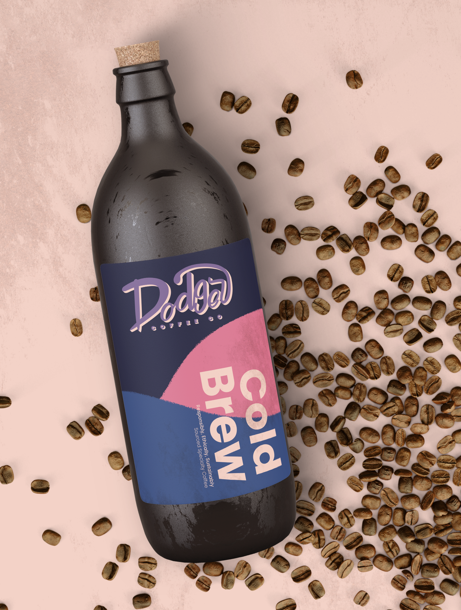
Dodger Redesign - Cold Brew Packaging
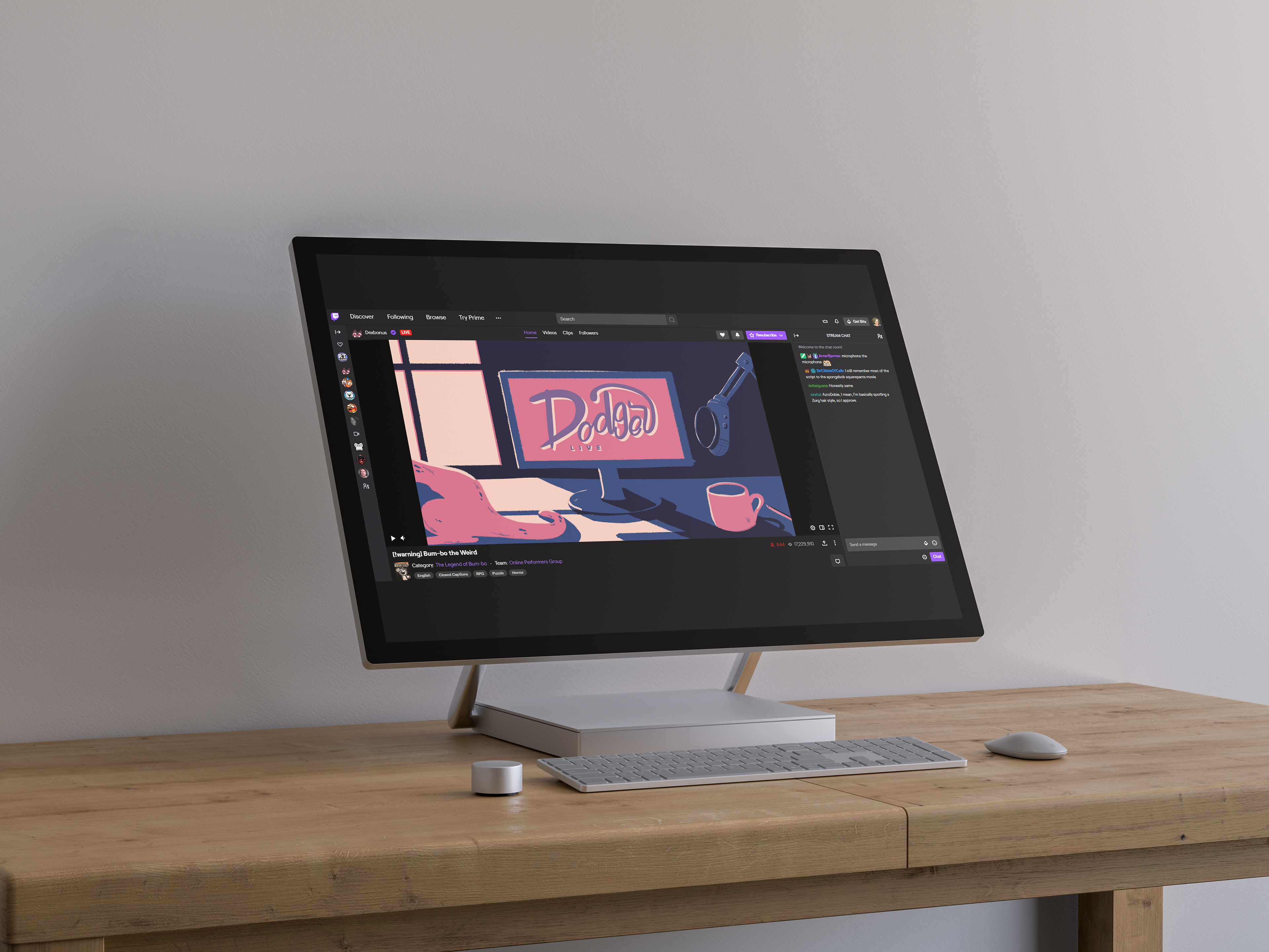
Dodger Redesign - Animation Application
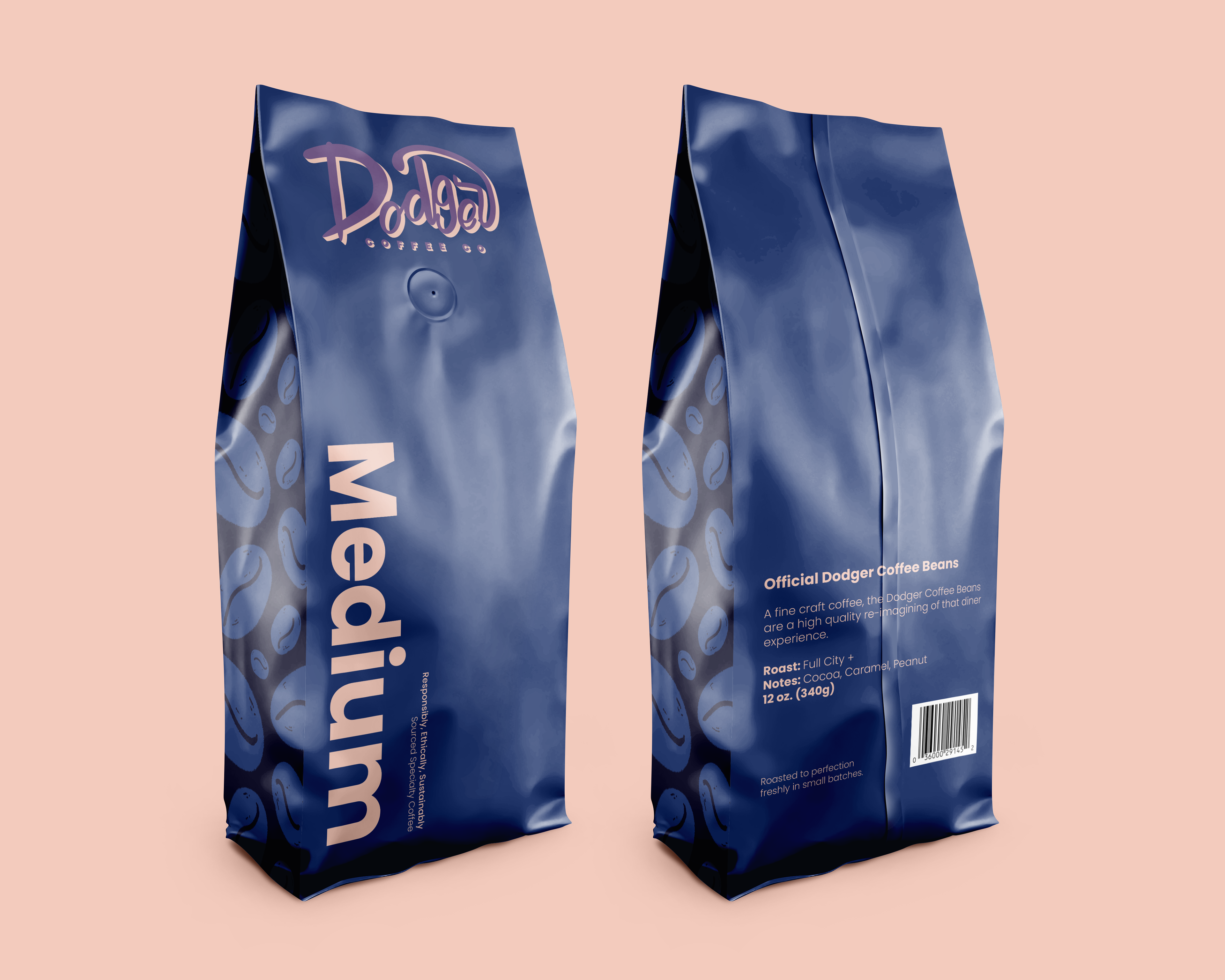
Dodger Redesign - Medium Roast Packaging
Dodger Coffee Company & Twitch Streams Redesign
Dodger is a gamer who livestreams on a website by the name of Twitch. This website, owned by Amazon, is an incredibly lucrative platform for live viewing of many different games and even art. She is known for steaming rouge-lites, dating sims, and more chill games than the normal high intensity streamer. She has built her brand on her love of coffee and cats, so she created a coffee company by the name of Dodger Coffee Company.
In this case study, I re-branded her livestreaming platform and her coffee company to be a more cohesive brand, so that on either website you knew who was behind it. The color choice was latching on to her chill atmosphere and her love of warm coffee and cozy cats.
Your Vote Matters
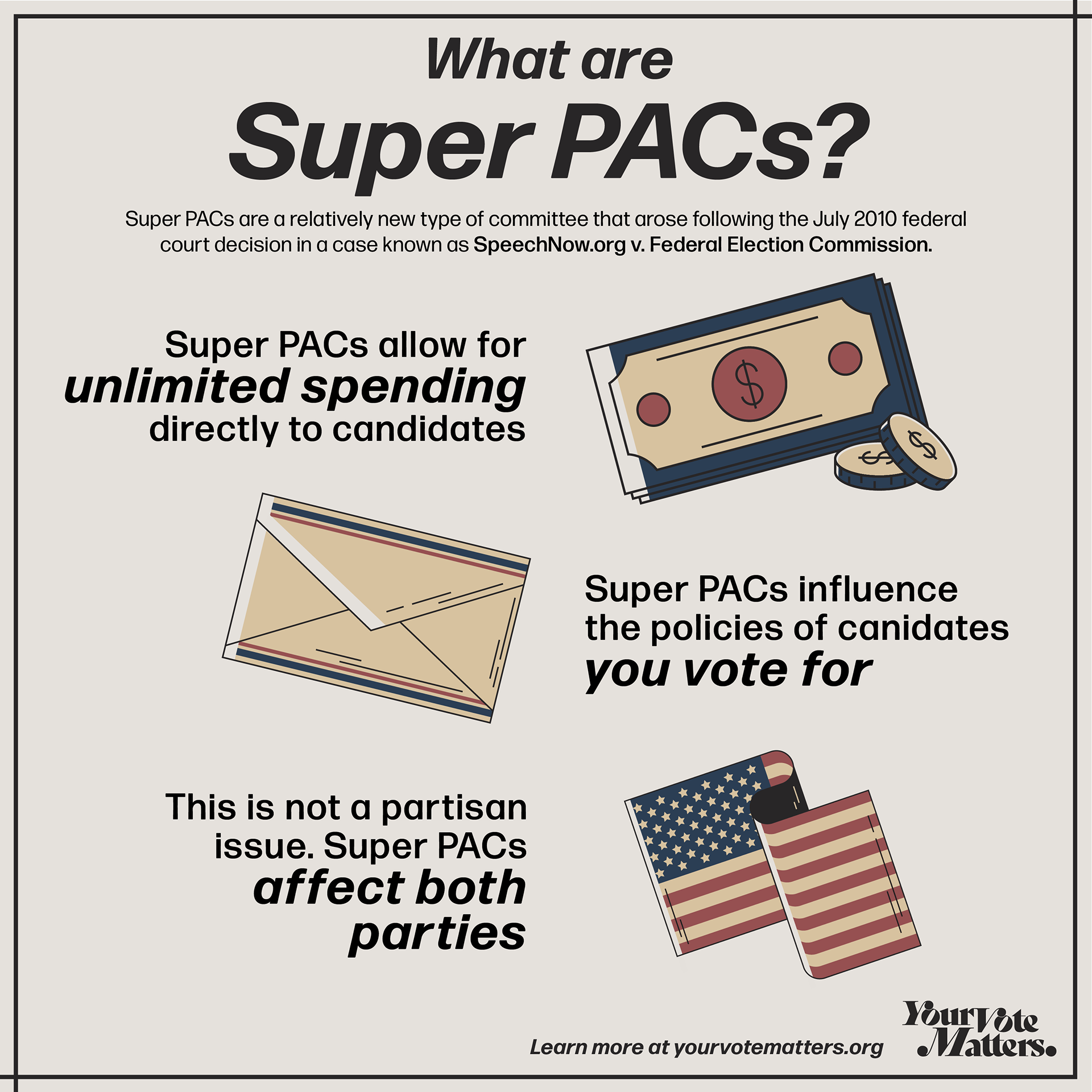
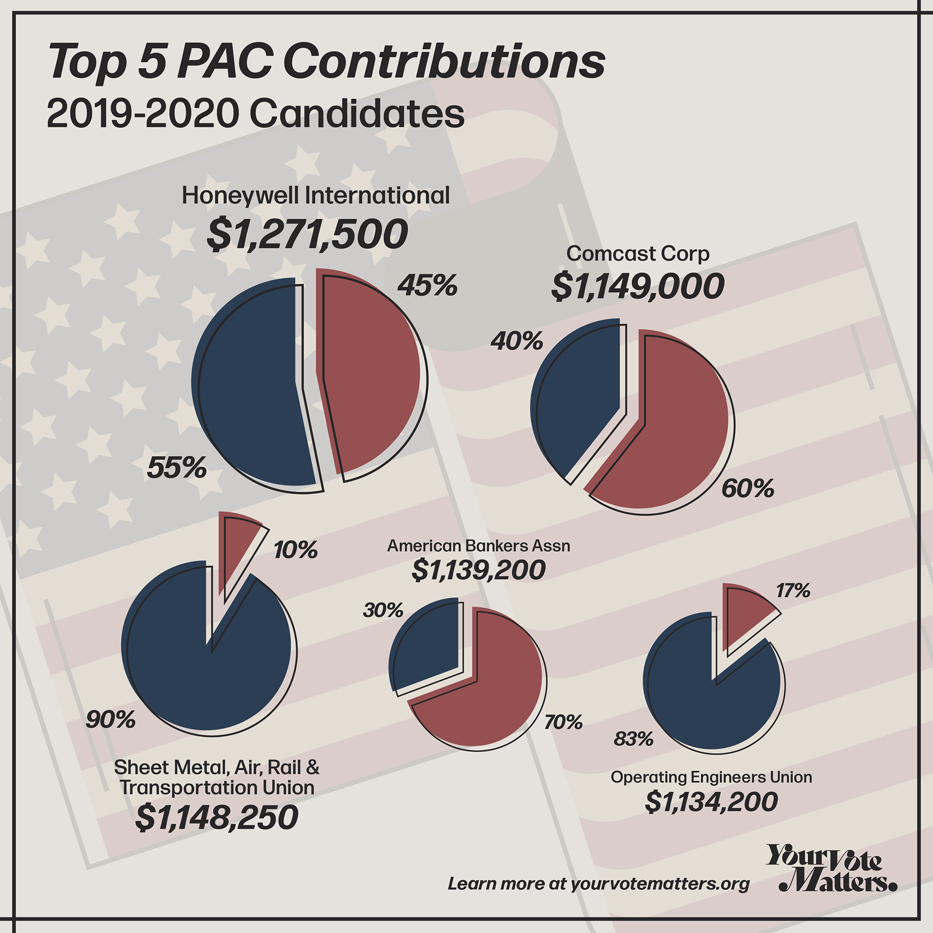
Your Vote Matters is an informative advertising campaign aimed at raising awareness of the role money plays in politics. This case study focused on what a non-partisan political ad campaign's brand identity would look like if solely focused on the facts. This non sensationalized company would reach out to under-informed audiences, focusing on real facts instead of pushing for one side or another. Most of these ads would be shown on social media, as many uninformed voters get most of their news online from unreliable sources. These ads would guide you towards the Your Vote Matters webpage where they could find more in depth non-partisan information.
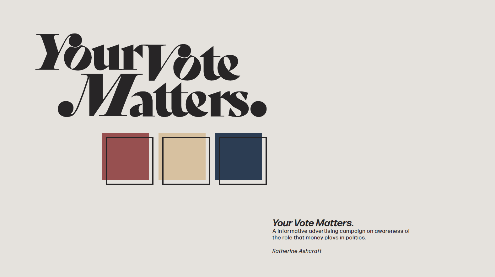
Your Vote Matters - Logo
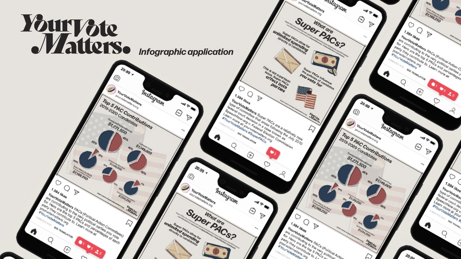
Your Vote Matters - Infographic Application
Your Vote Matters - Rendered Images
Your Vote Matters - Social Media Image Post 2
Your Vote Matters - Social Media Image Post 1
Steam Guard Mobile Authenticator UX Redesign
Steam is a large PC gaming store and application. The Steam Guard Mobile Authenticator is an app created by the company to ensure two factor authentication, and it is marketed heavily through their main platform as such a product. When using the app however, the main purpose is easily overshadowed by confusing menus and cluttered, outdated branding. These combined together made for a frustrating user experience.
Using the official Steam branding assets available to the public, I explored a fresh redesign of the user interface as a proof of concept. This case study explored working within an existing brand identity, understanding audiences, and user experience design.